Engaging and enjoyable experiences that support mental, physical, and emotional health.
Background
My Real Wellbeing app from Australian Unity is a wellness app designed to help customers (members) improve their overall well-being. It offers various features, such as health assessments, personalised tips, and tools to track and improve mental, physical, and emotional health.
I worked on this project as contract designer in the company’s Customer, Digital, and Technology team. The company had already launched their first Wellbeing App and the research team had conducted first-round preference testing.
Android and ios mobile app
Challenge
The business decided to further investigate how to motivate and reward members to improve their wellbeing after completing a preference test.
From the research, I discovered that despite completing the health assessment, users failed to continue using the app afterwards. The app’s text-heavy and theory-based features fail to integrate effectively into users’ lifestyles.
Additionally, the app’s demanding nature, with features like ‘Levels’ and ‘Streaks’, create pressure without offering sufficient benefits or encouragement.
Solution
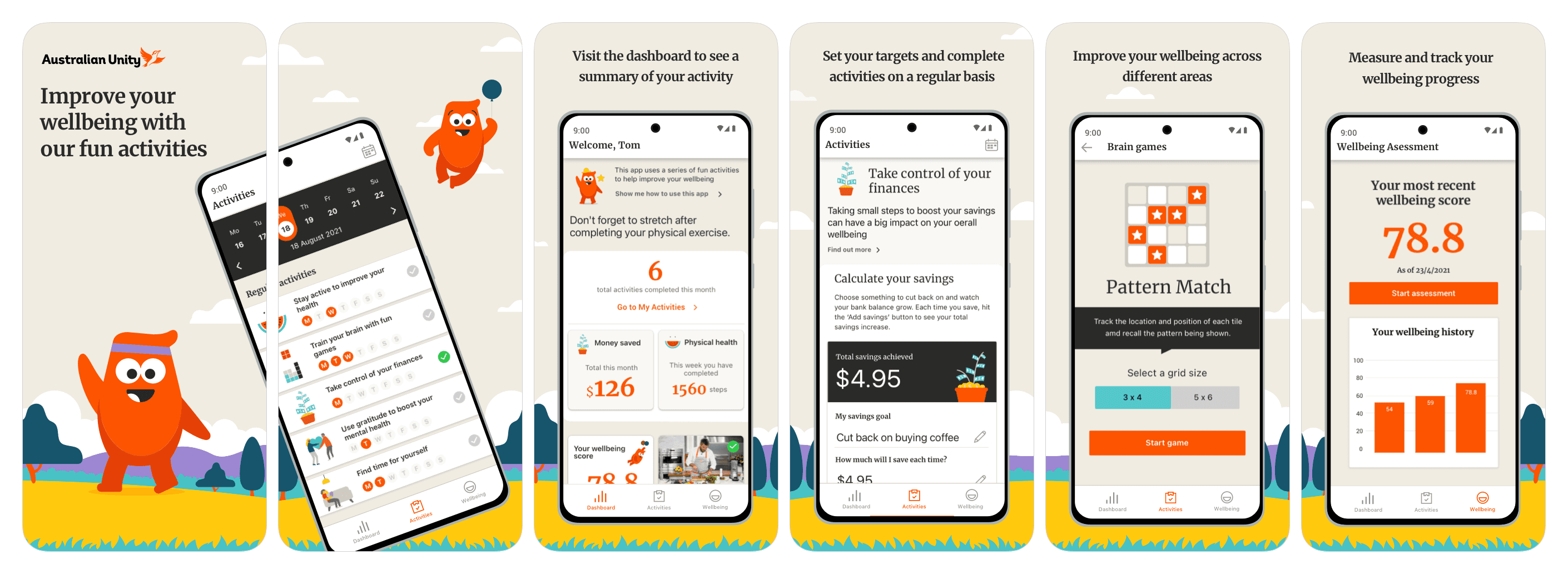
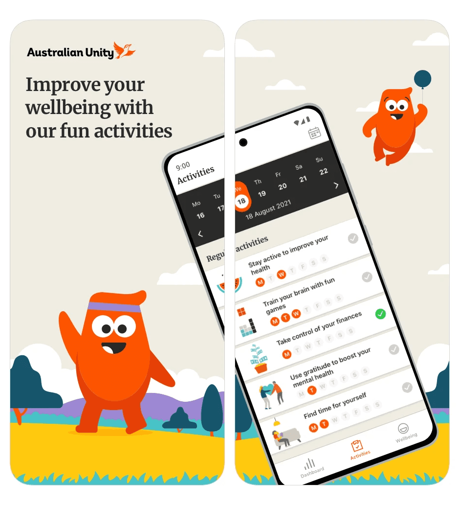
The new My Real Wellbeing app now does more to support what users need most. . It gives them automatic help, regular tips on how to feel better, and a better sense of achievement.
The reorganised information architecture presents bite-sized, useful information in a simplified interface, enhancing the user experience. The app’s communicational tone is friendly and engaging, guiding users throughout their journey.
Additionally, the balance of give and take has been improved by removing features like ‘Levels’, ‘Streaks’ and ‘Frequency’ and adding guides and helpful information. The new Dashboard gives users a clear overview of their progress and encourages continued engagement with the app.
Outcome
After the app launched in September, app usage in the week following was at its highest level all year.
Out of 635 app users, 535 were new (89%), an increase of 908%.
The app was downloaded 768 times in the first week of October, bringing the total since August 30th to 2049.
We received enthusiastic feedback from business stakeholders who reported that the app is fun and easy to use. . Most were using the app, synced from their other devices and felt a huge sense of achievement watching the increase in user uptake.
Design process
Click the list to see details.